Case study • Self-serve product
Credit Card Payment Options
A self-serve portal that lets customers with past-due credit card balances choose a payment option that fits their situation.
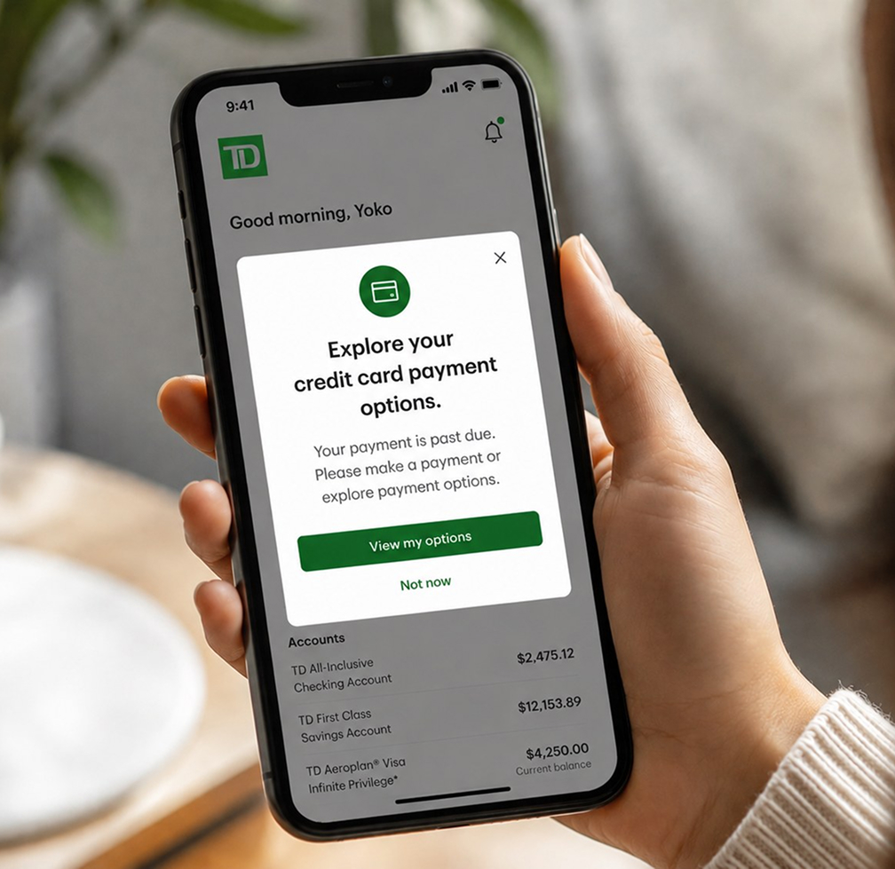
A self-serve portal that lets customers with past-due credit card balances choose a payment option that fits their situation.
Help for a past-due credit card was only available by phone, and most of the accounts that ended up sold to collections belonged to customers the call centre never managed to reach. Many never knew help existed.
Led design from concept to launch, leading two designers and partnering with content design and research.
Tens of thousands of customers used it in the first month, and nearly half took action. 2024 TD Project of the Year.
TD proposed creating a digital self-serve portal that allows the customers with past-due credit card balance to select a payment option based on their preferences and their financial situations.
Before, the same service was only available through the Call Centre. But most customers could not be reached, even after months of agents actively dialling before charge-off. Besides, many customers prefer a digital experience to engage with the bank to resolve their past-due account balances.
While this portal was a new concept for the Canadian market at TD, USA Online Banking already had a similar portal. Our design team was engaged to create an easy and intuitive experience for the customers to complete the flow with a certain action or action plan.
From the human-centred design objectives set for the project.
Convey consistently that TD is helping, not opening another transaction to collect money.
The payment options were complex and hard for a general audience to follow. Make them plain.
A simple, guided process that a stressed person can finish without confusion.
The research question was narrow and useful: identify exactly which elements, words, and steps people found frustrating or confusing. Not whether they liked it. Where it broke down.
A dedicated researcher on the team ran the sessions, and we designed the studies together. Two rounds:
Testing the copy separately mattered, because the options themselves were the hard part. The differences between paying in full, paying in part, and committing to an arrangement are not distinctions a stressed person should have to decode.
What came back:
It worked! Customers found the flow easy to complete and the options comprehensible.
The tone landed. They described TD as being on their side and helping them out of difficulty, which was the emotional result we were designing for and the hardest one to get right.
Many didn’t know help existed. Customers under real financial pressure had no idea the bank could assist them at all. That reframed the problem: this wasn’t only a servicing tool, it was how people would find out they had options.
Moving the service into digital banking changed who it could reach. In its first month, the tool reached tens of thousands of eligible customers, with 46% taking action, and 73% of the “offers” (payment options) presented were accepted.
About two-thirds of that traffic came through mobile rather than desktop, and the two channels converted at almost exactly the same rate. Customers in this situation were reaching for their mobile app. It also contributed to reducing charge-off rates and call-centre volume.
They found their options themselves, in a flow they understood, in a tone that told them the bank was trying to help.
It won the 2024 TD Project of the Year, was recognized across the bank for innovation, and was featured in the TD Innovation Showcase.
Within one month of initial launch:
What made this work was the team I engaged. A small cross-functional group, the senior business manager, a business analyst, a subject-matter expert, compliance, and the engineers, who stayed in close and constant contact through a Teams group chat and jumped on a call the moment something needed resolving. On a product this sensitive, that kind of trusted communication is what let us move quickly and get the details right.
It’s also why the Project of the Year award went to the team rather than to any one of us. That’s the right way round.
“Yoko’s data driven design approach ensures experience decisions are rooted in user experience insights… She effectively articulated the vision, design direction and from there fostered an inclusive, collaborative environment where she encouraged participation from all key stakeholders.— Sr. Manager, Business Management, CCR Leadership, TD
Truly one of the best partnerships I’ve had.”
Open to conversations about design leadership, product strategy, and human-centred design.
Contact me