Case study • Pre-work & proof of concept

Commercial Banking Portal

A single sign-on portal for TD’s US commercial customers, taken from discovery and design pre-work through the pitch that won a 14-week proof of concept, then validated on site with TD.

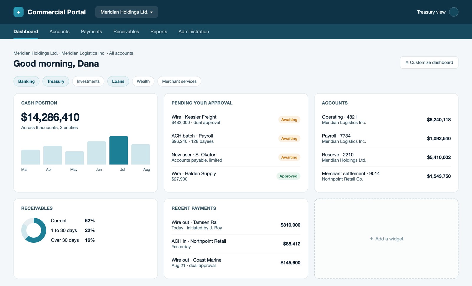
Concept of the commercial dashboard: cash position, approvals waiting, accounts across entities, and widgets the customer arranges
RoleUX Lead
TimelinePre-work + 14-week PoC
PlatformWeb responsive
ClientTD Bank US, via IBM

Problem

TD’s US commercial customers ran their day-to-day banking across several independent online applications, each with its own login and its own permissions. TD wanted one portal in front of all of it, and a partner who could show they understood commercial banking users, not just the technology.

My role

UX Lead. I ran the UX pre-work end to end, discovery through design, owned the UX side of the delivery estimate, and led the two weeks on site in New Jersey that put the work in front of TD stakeholders.

Outcome

The pre-work won a 14-week proof of concept, which shipped as a working responsive web build. Five personas, user flows for both the customer and the TD employee, a customizable dashboard, and entitlement management.

Context

The brief asked vendors to build the personas themselves, from their own commercial banking experience, and to show what they understood about the customer.

IBM took the challenge.

From what we knew, TD offered a number of key services to its commercial customers. Online, they were spread across independent applications, each with a separate login and its own idea of who was allowed to do what. The result was a fragmented customer experience, and an architecture too inflexible to innovate on.

After winning the challenge, IBM partnered with TD on the platform itself, a build both sides expected to run for years and to arrive in stages.

Key objectives

We turned the key pain points into three objectives.

Seamless integration

Bring the separate applications, services and products together in one place, arranged the way each user prefers.

Single sign-on

One front door for every commercial customer, with a sign-on that carries through to everything behind it.

Best-in-class experience

An experience built around how customers actually work, and flexible enough to keep changing with them.

What I did

I led the UX from the first requirement through to the last screen.

  • Owned the UX side of the planning and estimate. Worked collaboratively within the IBM team, analyzing the requirements carefully to size the UX line: the phases, the roles, the screen volume, and the assumptions underneath them.
  • Ran the pre-work end to end. Research and discovery, stakeholder interviews, personas built to locate the pain points, information architecture, concept design, and the pitch that won the work.
  • Led the UX through the 14-week PoC. Ran Design Thinking workshops to validate and co-create the personas, iterated the information architecture and user flows out of what came back, and delivered over 80 screens working closely with both TD and IBM stakeholders.

The pre-work

Most of my work on this happened before TD ever saw it. I structured the UX pre-work in four stages and led all four.

Discovery

Who are we designing for?

  • Requirement analysis
  • Commercial banking domain research
  • Industry & competitor research
  • User interviews
  • Identify personas

Ideation

What should it become?

  • Validate personas with subject-matter experts
  • Define pain points and goals
  • White-board dashboard components
  • Future state vision

Design

What does it look like?

  • Public landing page
  • Login screens
  • Dashboard concepts
  • Responsive layouts

Socialize

Does it hold up?

  • Share the transformed experience
  • Articulate its value
  • Take feedback and cycle it back

Discovery & ideation

I was designing for an audience I had to learn first. Discovery ran on four fronts: the commercial banking domain, TD's current experience, what competitors had already built, and the people who do this work every day.

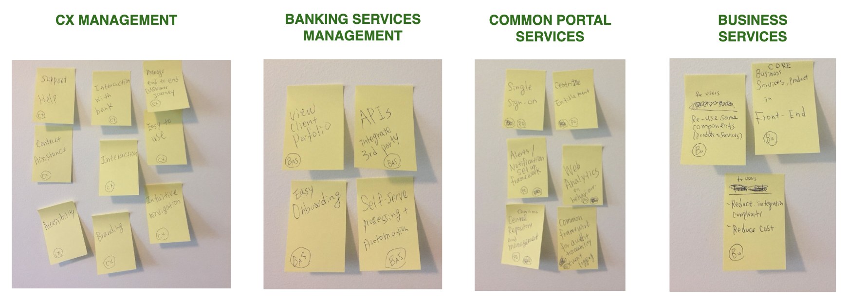
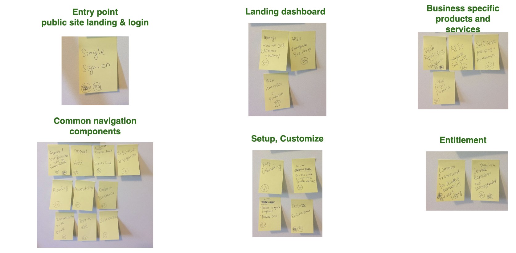
This is how I organize a complex concept into structure: I grouped the requirements into conceptual business capability layers, then translated those layers into UX point-of-view classifications, until I could see how high-level business requirements would map onto a screen. That translation was where ideation started.

Sticky notes grouped into four columns: CX management, banking services management, common portal services, and business services
Conceptual business capability layers. First pass: grouping each requirement by the kind of capability it actually was.
The same notes re-clustered into six screen areas: entry point, landing dashboard, business specific products and services, common navigation components, setup and customize, and entitlement
UX point-of-view classifications. Second pass: the same layers re-read as places on a screen. This is where the portal stopped being a requirements list and started being an interface.

From there I white-boarded the dashboard components themselves, grouped into segments: a default full set, plus banking, treasury, investments, loans, wealth, merchant services and marketing.

The problems we were solving

Two pain points shaped everything downstream.

A commercial customer is not a person, it is a hierarchy. A holding company, the businesses under it, and the staff inside those. Who may see which account and who may approve what changes at every level, and one dashboard had to serve all of them.

The bank’s own staff were users too. Every permission in the portal is granted by someone at the bank, and that job needed designing as carefully as the customer’s. That person became a persona in her own right once we were on site.

Design

This is where it stopped being a strategy and became a product.

The dashboard concept. I designed the flow that assembles those components. On first run the user picks their job, the system knows what their company subscribes to, and the two decide which components load. Two variations made the point: a finance manager with a dense dashboard, a bookkeeper with very few.

Advanced features. Concepts TD’s portal could not yet do: an assisted chatbot, and biometric authentication across voice print, fingerprint, retina and face.

Sizing and planning the work

The requirements covered login, single sign-on, entitlements and the dashboard. The business side ran a gap analysis against what existed today, and turned the result into a short and long term engagement plan.

I owned the UX line of that estimate. Working with the delivery lead, the project manager, the UI development lead, the business analysts and the human-centred design delivery leader, I built the UX sizing separately from the overall cost model: the phases, the roles, the volume of screens, and the assumptions the numbers rested on. Responsive across four breakpoints, two languages, and accessibility to WCAG 2.0 AA.

We presented the pre-work and the plan together: my UX research, personas, and dashboard design alongside the team’s estimates, deliverables and technical approach, and a demo the engineering team had built.

We won the 14-week proof of concept.
Two weeks in Mt. Laurel

The team relocated to TD’s US offices in New Jersey to deliver. The UX team went for the first two weeks, to start the project on the right problem.

Everything we had built was still a hypothesis. TD had seen it and backed it, but it had been built without their data and without their people in the room. So the first two weeks were spent testing it rather than defending it.

Validate personas

Defined the pain points and goals, and iterated to five personas, covering both the commercial banking customers and the TD employee who serves them.

Run the workshops

12 hours of Enterprise Design Thinking with TD stakeholders. Empathy mapping and an as-is scenario laid out chronologically, so the group could see where the current process actually broke down rather than where we assumed it did, then ideate against it.

Outcome

The design team returned to Canada with the foundations validated. The rest of the team stayed on site to build against them. The work never went quiet in between: collaborative UX reviews with the TD team and demos of the build ran on a regular cadence for the rest of the engagement, so nothing arrived as a surprise at the end.

What the cross-functional team shipped inside the 14 weeks was not a slide deck. It was a working responsive web proof of concept, with real APIs behind it.

The design foundations that went across with it:

  • Five personas
  • Two user flows
  • UI screens for a customizable dashboard with components
  • Entitlement management screens for TD staff
80+UI screens delivered
20+APIs built
14weeks, concept to working PoC

Reflection

This was the first competition I had taken on, and commercial banking was a domain I did not know. I had to get up to speed fast, and the way I did it was to ask.

I interviewed 11 IBMers for background and insight: designers who had worked on a commercial banking CRM, a data scientist, commercial banking subject-matter experts, partners who knew TD, developers dedicated to TD projects, the design department leader, and a Design Thinking coach. Five more sat for bank user interviews, including IBM’s US Treasury Operations CFO. Every one of them was willing to share what they knew.

That is where I learned how to build personas properly: what data to ask a client for, and how to use it to identify the right users rather than the obvious ones. A persona is only as good as the segmentation underneath it.

I was the only designer for the most part on this project, but I was never working alone.

The success came from the collaborative effort of the people around me.

“Yoko is an extremely talented person as a Lead Designer who continually thinks outside the box for the best solution. She is also passionate, hard working and has a great eye for detail. A lot of people can generate what you ask for, but it takes a really talented designer like Yoko to deliver and make those campaigns resonate. Yoko goes beyond expectations and always delivers on time.”
— Partner, IBM

Let’s create something people love.

Open to conversations about design leadership, product strategy, and human-centred design.

Contact me