Case study • Internal operations tool

Auto-Loan Platform Modernization

A discovery-led, future-state redesign of Scotiabank’s auto-loan platform: making sense of a sprawling legacy system and reorganizing it around how lending and funding officers actually work.

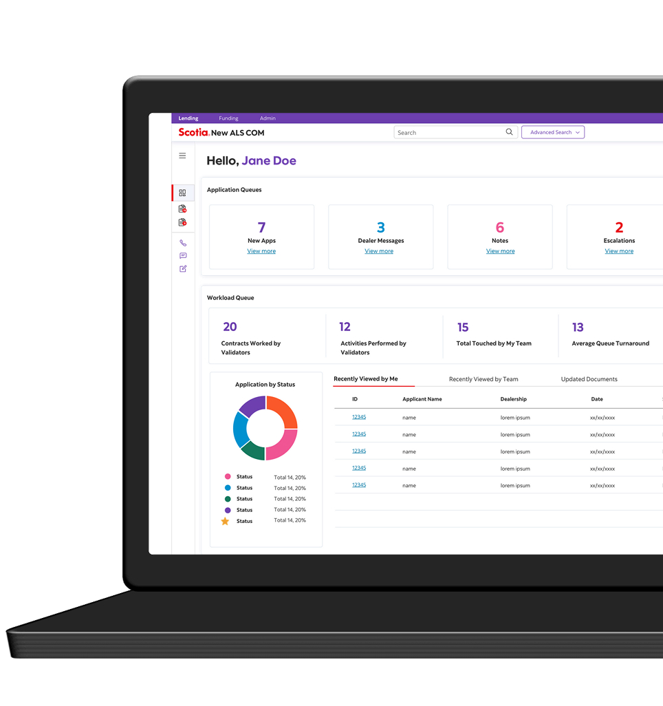
Auto-loan platform — officer dashboard with application queues and workload metrics
RoleUX Lead
Timeline6 months
PlatformDesktop web
ClientScotiabank, via IBM

Problem

Modernize Scotiabank’s aging 1990s auto-loan platform with no requirements to work from: the engagement itself was to clarify the current issues and define both the future-state vision and the design direction.

My role

UX Lead: ran discovery, owned strategy and planning, facilitated the Design Thinking workshops, and led a team of three designers (one UX, two visual).

Outcome

Delivered 61 pages of design template documentation: the unified platform’s architecture, organized and prioritized around the officers’ work.

Context

Scotiabank’s auto-loan platform is a large, intricate program: dealer-originated applications move through queues, adjudication, and approvals, with manual steps, stipulation management, credit-bureau assessment, income calculators, employment verification, document scanning and file management, and direct dealer communication by call and live chat. Prime and Near-Prime ran as separate experiences.

We were brought in at the discovery phase, with no formal requirements to work from. The reference material we were given was screen-by-screen captures of the existing system: over 100 pages for Prime and another 100+ for Near-Prime. They showed what each screen looked like, but we needed to know far beyond the screenshots. Which features officers relied on, which they didn’t use, what they wished the tool did, what the pain points were. That’s where our discovery journey started.
Design objectives

The three pillars of objectives came from user needs.

Unify the platform

One platform for auto-loan processing, merging the Prime and Near-Prime application streams into a single, streamlined process.

Simplify & automate

Fewer screens and a simpler, more intuitive flow, with automation wherever it optimizes the work.

Centralize communication

One place for communication between the different user types.

What I did

  • Owned myself: scope investigation and requirements analysis; the design-execution roadmap, resourcing, and scheduling; and the strategy for the future-state concept.
  • Facilitated: 12 hours of Enterprise Design Thinking workshops and 21 hours of design-review sessions.
  • Led: one UX designer and two visual designers, guiding direction.
  • Partnered with engineering: weekly technical-feasibility sessions to keep the concept buildable.

Research & discovery

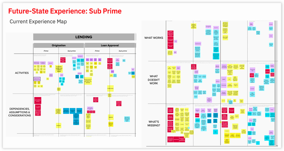
It began with the working sessions, where we mapped out what we needed to know. From there, using Enterprise Design Thinking, we ran walk-throughs and workshops with the officers, supervisors, adjudicators, approvers who actually run the platform, the only people who held the full process. Three things surfaced:

The real system was far larger than the surface suggested. Workshopping with users revealed features and steps you could never see from the outside.

A single application passed through many hands. Each role came to the same application needing something different from it.

Some of what surfaced fell outside our scope. I raised each one with leadership straight away so we could decide together: in scope, out, or renegotiated.

The achievement

We successfully captured every aspect of this massive platform, then organized, categorized, and prioritized its features around user needs, turning what had only existed as raw screens and tacit, in-people’s-heads knowledge into a structured, buildable architecture.

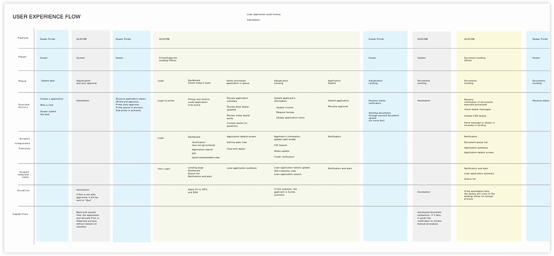
Feature architecture organized around the officers' core tasks
Prioritized feature map for the future-state platform

Design & iteration

From that structured picture, we designed the future state for one integrated Prime and Near-Prime platform, organized around the officers’ core tasks: a focused decisioning view bringing the decision fields, stipulations, and dealer communication into one place, and a workload dashboard giving officers and supervisors their queues and workload at a glance. Not everything we explored was carried forward. The dashboard concept was ultimately descoped, though it stayed in the documentation as a designed future state.

We worked from low to high fidelity. Simple black-and-white low-fi wireframes set the navigation structure, content hierarchy, element placement, key features, and behaviours; from there the team built hi-res mockups of the final template designs, using Scotiabank’s existing brand guidelines so the new program integrated seamlessly with the current experience. Wireframes were iterated through 21 hours of design reviews, with weekly engineering-feasibility sessions keeping every proposal buildable.

Outcome

The engagement ended in 61 pages of design template documentation for the future state platform. It covered the navigation and its components, the Prime and Near-Prime application summaries, lending and funding documents, communication tools, queue and workload management, the officer and supervisor dashboards, admin, and login, alongside the visual design templates, a design library, and accessibility and behaviour guidelines.

That document is the proof of the discovery. We began with no requirements and 200+ pages of screenshots that showed the screens. We ended with 61 pages of structured, prioritized design, built from what the officers knew and validated with engineering as we went. We handed it off as the blueprint for the build, which carried on from there.

61pages of design documentation
12 hrsDesign Thinking workshops
21 hrsdesign-review sessions

Let’s create something people love.

Open to conversations about design leadership, product strategy, and human-centred design.

Contact me